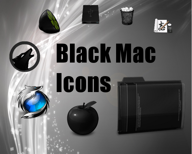
Description: Still Under Construction! THIS IS NOT A COMPLETE THEME ITS JUST A WORKING PREVIEW
This is just to give people a feel of what's coming and to share thoughts and ideas. Any gnome or other theme based icons that you can see in the working preview will be faded out with subsequent releases, only black, or black based icons will be part of the final theme.
--------
I have been browsing other Mac themes for research and alot of them seem to be heavily criticised for infringing copyright. Does anyone mind clearing up for me exactly what i can and can't include in this theme. Any info would be greatly appreciated!
Based on a port of some black Mac icons found and converted to png format by cb2k. I am currently in the process of making it into a usable theme, acquiring/making additional icons and making it as complete as possible before i release it in a beta format. Let me know what you think or if you have any ideas or suggestions. ThanksLast changelog:
0.0 - Preview 0.1 - Working Preview 0.2 - A few minor changes
Thanks Kai, Im hoping to get quite a bit of work done on it in the coming weeks, ive been tied up with alot of stuff recently and some of my other projects have been getting more attention than it when i have had time, fingers crossed i could have a virtually complete version ready within a month though =)
For myself and, if the screenshots here are any indication, others as well, a dark icon theme goes well with a dark gtk theme, which in turn creates a dark panel. If you're using mac icons as an inspiration, you might want to look elsewhere for some of the panel applets as many macish themes use monochrome black icons on the panel, which makes them almost invisible on a dark backgrounded panel. I love the preview though. Cant wait for the first release!
Thanks, I hope the full release can live up to expectations. Thanks for the panel tip, I think ill scout around for some panels on which the theme looks good as it definitely appears to be an issue.
Follow the correct rules of building the Set. Take the Gnome-Set as example for the correct naming and the correct Symlinks. Don't make a Set only with 128x128 and let it scaling by the system. Use better this: 128x128 scaleable, 48x48 fix, 32x32 fix, 24x24 fix, 22x22 fix and 16x16 fix. Scale it with good tools like gthumb for example. Correct small sizes by hand. Overloaded Icons should be cleaned up a little bit before scaling in 24x24 and less. Be care with the consistent... Or you want call your Theme Masup-Black-Edition? :-) If you follow all this, your Theme can be taken for something serious. ;-)
Thanks for the pointers. I hope i'll be able to keep to all of them. Initially for the beta version however i am intending to initially release them purely as all scalable icons so that (a) people can get a proper feel for the theme and see what they like/dislike. (b) to speed up amendment changes to the theme so that it can be fine-tuned quicker and (c) keep the download time down for people. However once i have got a working, polished theme i do intend to release a version that will finished to a higher standard like you suggested, with icons segregated by size.


Ratings & Comments
10 Comments
when it's released :) very nice!!!
Thanks Kai, Im hoping to get quite a bit of work done on it in the coming weeks, ive been tied up with alot of stuff recently and some of my other projects have been getting more attention than it when i have had time, fingers crossed i could have a virtually complete version ready within a month though =)
Even the preview is a worthy icon set. Looking very nice. respect of course.
Thankyou very much, keeps your eyes peeled for the full release =)
For myself and, if the screenshots here are any indication, others as well, a dark icon theme goes well with a dark gtk theme, which in turn creates a dark panel. If you're using mac icons as an inspiration, you might want to look elsewhere for some of the panel applets as many macish themes use monochrome black icons on the panel, which makes them almost invisible on a dark backgrounded panel. I love the preview though. Cant wait for the first release!
Thanks, I hope the full release can live up to expectations. Thanks for the panel tip, I think ill scout around for some panels on which the theme looks good as it definitely appears to be an issue.
Can't wait, man! :D
check out the working preview now, its still a long way from finished but should give you a taste of whats to come...
Follow the correct rules of building the Set. Take the Gnome-Set as example for the correct naming and the correct Symlinks. Don't make a Set only with 128x128 and let it scaling by the system. Use better this: 128x128 scaleable, 48x48 fix, 32x32 fix, 24x24 fix, 22x22 fix and 16x16 fix. Scale it with good tools like gthumb for example. Correct small sizes by hand. Overloaded Icons should be cleaned up a little bit before scaling in 24x24 and less. Be care with the consistent... Or you want call your Theme Masup-Black-Edition? :-) If you follow all this, your Theme can be taken for something serious. ;-)
Thanks for the pointers. I hope i'll be able to keep to all of them. Initially for the beta version however i am intending to initially release them purely as all scalable icons so that (a) people can get a proper feel for the theme and see what they like/dislike. (b) to speed up amendment changes to the theme so that it can be fine-tuned quicker and (c) keep the download time down for people. However once i have got a working, polished theme i do intend to release a version that will finished to a higher standard like you suggested, with icons segregated by size.