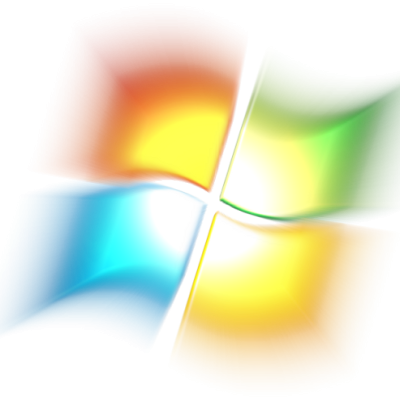
Please, help !
I d`ont understand how to change the menu stile. I serch web, but it gives nothing...
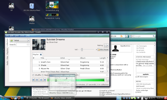
How to make a menu such as at image ?
yours respectfully
ustos
firstly you must be using the "Gnome" desktop for "linux". Secondly you must install "Gnomenu". then you right click on the "panel" and select "add to panel".
select "gnomenu". Then right click on the menu image that appears on the panel and select "preferences". select the tab labeled "Panel Button". Then select a button image. click ok. then select reload if the popup asking for reload comes up.
Hope that helps!
John
I rated it Good for a couple of reasons. I really like the idea of a "corner button" per se. Even though most start buttons can be chosen in the very corner of the screen, the shape of them still may have the user trying to click in directly. A corner button subconsciously potentially makes it easier and faster for users to swing the cursor to the corner without thinking, quickly and easily.
The design is good, but it could look better. Unfortunately, I am not a graphic designer, so my suggestions are limited. Maybe something smaller.
Anyway, concept kudos!
hey, thanks for your feedback I appreciate it. By smaller do you mean sized for a smaller taskbar or should it be smaller in width? and by different look would you like to see other colors or different styles such as less gloss and more of a squareness instead of slightly rounded edges or just flatter looking? If you could give me a few hints that would help abunch thanks again! :)
John
Well, it does seem a little big to me, but that's only because I use a 24px height. I did mean; however, smaller in width. The most important to me is that it takes up the entire corner. A little more rounded would be cool, kind of like in super mario (the corner thing he uses to run up walls) :D The gloss is probably also per preference of the user. Anyway, looks great, and thanks for listening!


Ratings & Comments
7 Comments
Please, help ! I d`ont understand how to change the menu stile. I serch web, but it gives nothing... How to make a menu such as at image ? yours respectfully ustos
firstly you must be using the "Gnome" desktop for "linux". Secondly you must install "Gnomenu". then you right click on the "panel" and select "add to panel". select "gnomenu". Then right click on the menu image that appears on the panel and select "preferences". select the tab labeled "Panel Button". Then select a button image. click ok. then select reload if the popup asking for reload comes up. Hope that helps! John
very original :D
Ok, that's beautiful and different. Really good job!
I rated it Good for a couple of reasons. I really like the idea of a "corner button" per se. Even though most start buttons can be chosen in the very corner of the screen, the shape of them still may have the user trying to click in directly. A corner button subconsciously potentially makes it easier and faster for users to swing the cursor to the corner without thinking, quickly and easily. The design is good, but it could look better. Unfortunately, I am not a graphic designer, so my suggestions are limited. Maybe something smaller. Anyway, concept kudos!
hey, thanks for your feedback I appreciate it. By smaller do you mean sized for a smaller taskbar or should it be smaller in width? and by different look would you like to see other colors or different styles such as less gloss and more of a squareness instead of slightly rounded edges or just flatter looking? If you could give me a few hints that would help abunch thanks again! :) John
Well, it does seem a little big to me, but that's only because I use a 24px height. I did mean; however, smaller in width. The most important to me is that it takes up the entire corner. A little more rounded would be cool, kind of like in super mario (the corner thing he uses to run up walls) :D The gloss is probably also per preference of the user. Anyway, looks great, and thanks for listening!