


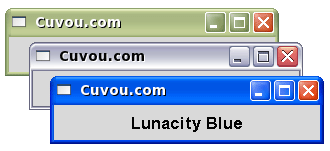
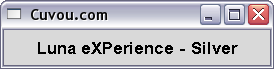
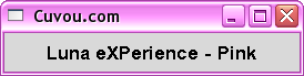
So, I created the blue one first, then the silver one, then decided to make a pink one based off the silver (there aren't enough pink Metacity themes around here).
To those of you who couldn't find the start button (because you couldn't just search this site for "start button" and find it), I got it from here:
http://gnome-look.org/content/show.php/cristal+start+buttons?content=57477
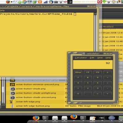
The GTK+ theme in the screenshot is a modified Linsta3.
Update: added mirror links for all the files, just in case my server goes down like it did for a few hours this afternoon.

Update (Version 0.02):
I decided to rename the theme Lunacity (a combination of Luna and Metacity, since Luna themes do exist for other window managers, and because I don't plan on making a GTK+ theme, this name fits it better).
I've added the olive green theme, making this a complete Luna set (plus pink). Also, maximized windows lose their curved edges and borders now, like they should.
NOTE: All four themes are included in the one tar.gz file, so extract it and then install the particular themes that you want via their tar.gz files within.


Ratings & Comments
32 Comments
9 +++
Please, update link!
i don't think if one Metacity is like Windows then it is bad. so many ugly and lame makes my eyes so tired, for me, this Metacity is clear, bright, and beautiful. it has a good 3D effect. i like it very much! thank you for your job! in these four, i don't like the Pink and the Silver, because they seems a little lame and lack 3D effect. i hope they can like the Blue and Olive.
would anyone want their desktop to look like windows? I'll tell you why; because you're booting it off a thumbdrive at work, and you don't want nosy techs to notice that you're not using there shitty software. this is perfect for me, thx!
The funny part is, at work I AM the 'tech' and I use things like this to make the USERS think they're still using windoze.
yea, sad thing is most people really will fall for it! :p I on the other hand would notice the instant I clicked anything... the lack of the simple sharp shadows on drop down menus, the fonts, the probable fact that a small section of the "start button" (assuming you mod this to fool them too) rather lights up where it shouldn't, or doesn't where it should. I would hope that EVERYBODY notices the fact that the "start button" would also have no unique "pressed" state :p
This theme is excellent! I actually made the same one in emerald/compiz. The theme is called WinXP.
Sorry, but I must say this theme is not like the windows' one. This one as terribly rounded corners. WinXP has nice rounded corners. Can u see that darker top corners colors then titlebar's?
I don't see how you figure that Windows has any difference in rounded borders than this one does. I obtained all these graphics by taking screenshots of my Windows desktop and made everything that wasn't a part of the window borders be transparent. See for yourself, go into Windows, take a screenshot of a Luna-themed window, go back to Linux, and compare the screenshot with the graphics in the Lunacity set, they'll be exactly the same. Any discrepencies in "roundness", I'd say, is a bug with your Metacity engine, because the actual PNG files should and do match up perfectly with real Windows windows.
Well, your right about the roundedness, but the top sides are darker for some reason! Just look! But, maybe it's like that in real windows too...
No, it's not.
No, I don't see the difference:)
If it is the case that you used windows screenshots to create this then you cannot license it under the GPL. I see windows and mac themes on this site all the time that claim to be GPL, but in fact they probably aren't even legal.
why would anyone want there linux system looking like windows? :S
yeah, it is good question. Hundreds of vista icon themes, vista metacity themes, vista gdm themes, vista cliparts, vista desklets... isnt there way to make something originall? But good luna theme may be useful sometime. Thanks, but you could use your time by better way ;)
I don't like the idea of my Linux desktop looking like Windows, either. In fact, I used to be a KDE guy until I saw a preview of KDE4, and I didn't like how its default settings looked like it was trying to impersonate Windows Vista. Why anyone would want their desktop to look like the loser operating system that Vista is is beyond me. I disliked it so much that I've switched to something with GNOME for the default desktop, and I went with Ubuntu, in fact. Besides, even though some may not like its default brown color scheme, Ubuntu is, after all, making a visual identity for itself on the desktop, and that's part of how you make your business known is to have a certain look and feel, such as, for example, Coca-Cola's red and white logo. Same thing goes for Ubuntu and their brown, copper, gold, and orange default desktop appearance. That said, however, there are quite a few people who are currently Windows users who are considering a switch to Linux, and for them, yes, I'm pretty sure most of them would feel a lot more at home if a Windows-ish look were present. As for their attempts to look Vista-esque, I understand what KDE is trying to do here, but it isn't for me.
You specify on the download page two statements that directly contradict the GPL: # 3 You may NOT redistribute the source code on your own website without my permission. Just e-mail me for permission and I'll probably allow it, but I want to know what sites my software is used on. If I find somebody offering an unauthorized download, see rule #2. # 5 You may ONLY recompile the program for personal use. Either change the license or change what you state on your site since this is most definitely *NOT* what the GPL states.
Yeah, what happened was I have these generic download pages for all the files on my site, for source codes, binaries, and font files, and didn't make one specifically for GPL downloads. Regardless, I had gnome-look link to these pages to guage how often the particular Metacity themes were downloaded. At any rate, now that I know, the files are just hosted on gnome-look now. :)
Sorted! :-)
what about an olive one?
i really like this theme. thank you so much.
Could you look for it? I can't find a XP start button for Gnome anywhere.
You could have just searched "gnome-look.org" for "start button" It turned up this result, which, iirc is where I got that start button from: http://gnome-look.org/content/show.php/cristal+start+buttons?content=57477
You could have just searched "gnome-look.org" for "start button" It turned up this result, which, iirc is where I got that start button from: http://gnome-look.org/content/show.php/cristal+start+buttons?content=57477
good job. but how can i get the same bottom panel? i mean the blue one. i have installed this theme, but i dont get it.my panel still the same with previous theme. thank you.