


-----------
It seems that it didn't work, sorry about that, I'm sure it works perfectly now.
Thanks for pointing out my error Thomas


Source (link to git-repo or to original if based on someone elses unmodified work):


More Be-Shell/Bespin from OpenAugusto:
Other Be-Shell/Bespin:

Ratings & Comments
17 Comments
How to install this file
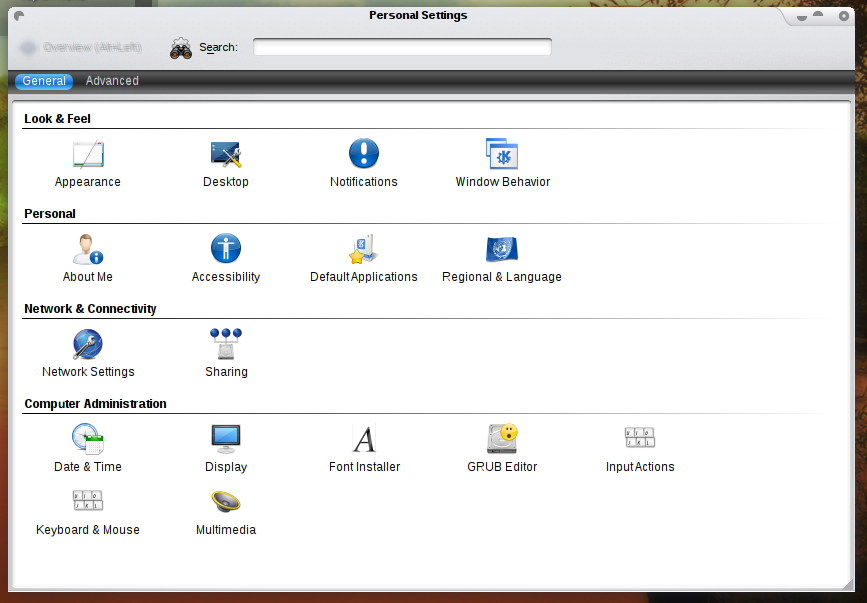
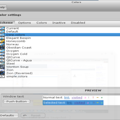
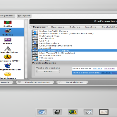
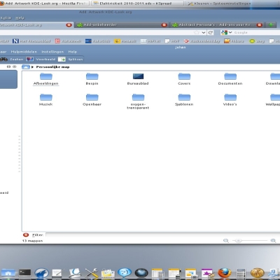
First install bespin (which may be on your distros repos), then on system settings go to appearance, style, select bespin, then configure and import the .bespin file, ok, and you're done.
I use KDE 4.1 after install Bespin form svn . the bespin configure button is disable. so how can i import .bespin file? Please any suggestion.
humm? the f*** kstyle desktop file should menawhile install to the right place... :-( however, you can type "bespin" into krunner or konsole and get a standalone config dialog (and more, try "bespin help" in konsole)
Hurraa... thanks.. Now it's working.
Inactive icon can be improved still. It looks messy in its current state, really. I think it's better if it behaves the normal way instead of making it blurry. I know this theme is based on Bespin. Maybe you could hack on it and then change it? Very nice overall. Thank you.
the day KDE takes the effect settings for (at least) toolbars into account again (atm. they're just semiopaque, no chance for desaturation or anything. and i'm not even talking about using the styles function to change the icon look, as Qt supposes and plain Qt does) you'll get a button "use KDE settings for icon effects" ... not sooner :(
Do you mean it's not possible yet? I think it is. Oxygen can do the trick and Bespin is based on it in the first place. I don't see why this theme cant' do it as well...
1st off (just for clarification) current oxygen is rather based on plastik. 2nd: it's even pretty simple. i'd just not inject another icon ;-) but: KDE offers a way to control the look of icons (also for the toolbar, 3 states) but just ignores these settings (as well as the fact Qt toolbuttons usually take the style into account, i.e. there could be an option "style dependend") also this differs from the look of disabled icons in plain Qt apps :-( see, i could easily offer: - blurred - qt like - kde settings but imho it's on the KDE side to offer a mode for the (Qt default) style side appereance and respect it's own settings btw, just curious (and really interested): what are your objections with the blurred icons? (i found the fixed KDE look works lousy on dark color schemes - where disabled hardly differ from enabled icons... :(
I guess english is not your primary language 'cause I don't understand your reply. Anyway, I really would like to have inactive icons greyed out instead of making it blurry. Imagine a beautiful peace of art smudged by an innocent kid, that's how it looks like to me. It's messy.. And the handle bars too on the places/info dock. It think it's better if it's not dotted like the way it is. Again for that matter, the default way would be better.
These two suggestions together with this (http://forum.kde.org/kde-ui-layout-t-17979.html), your theme would be perfect IMO.
this is a problem of KurlNavigator (i do not like the look) it's meanwhile possible to use styles on custom widgets as well, but it yet does not make use of it. you may file a bug at bugs.kde.org or bother peter.penz -att- gmx.at aseigo, ervin, uwolfer (all at kde.org) directly much luck.
ok, once again: 1) toolbuttons usually ask the style on what the disabled/active state should look like KToolButtons (i.e. toolbuttons in most KDE apps don't) 2) KDE supports user configurable icon effects (this is reasonable, the style in query may have a dumb idea on the look ;-) type "kcmshell4 icons" into konsole and select the advanced tab a) there could be an option like "use style" b) whatever you change here: it's not applied anywhere. disabled toolbuttons will always be semi-opaque 3) this is visually incompatible to plain Qt apps (QToolButton) which desaturate disabled icons by QStyle (base of all styles) default. 4) so the solution i could offer was to provide custom icon appereances as well, bypassing inoperative KDE code. but that's the wrongest way to do this. therefore i provide /my/ style setting and as soon as KDE works again, the bespin code will be modified so that KToolButton can easily choose to use a user config'd or the style look icon (sidenote: the semi-opaque icons are hardly notable as such on dark color schemes - i.e. white on black)
oh, and there's nothing like a "default" look for the splitter. (the "default" qcommonstyle - first complete implementation of the qtsyle interface - draws nothing) please refer another style or a screenshot or mockup, thanks
I corrected it manually.
probably. black sunken gradient raised buttons by def? (not visible on the SS)
Hi, i hate to say this, but the config file does not describe the setup on the screenshots (i can read them plaintext ;-) if unsure about the dialog usage (my fault) try bespin export "The Config Name" some_file.bespin you can also try out exports like bespin try some_file.bespin feel free to contact me on further issues