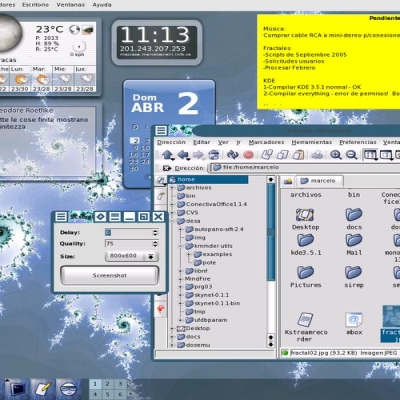
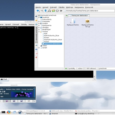
Description: A theme for DeKorator. Please add comments if you think it can be improved. Screenshot 2 shows that it's not bad for colorizing frames, but I'd advise against colorizing the buttons. Enjoy!
..it's not to minimalistic and it's not to serious. it looks just nice to me. therefore i have no suggestions for improving this so far.
really nice work.
thank you for that work
Try making the background for the buttons the same gradient as the titlebar (the part with the window name), and try make the buttons themselves a less bright color. If you want me to test it before releasing, email me (admin@cheeseburgerman.net) with the file. I'll try to give some more suggestions then. :-)
Sorry, I clicked on the second screenshot twice instead of looking at both. The button background color section is completely irrelivant. I'd still try changing the color of the buttons though.


Ratings & Comments
6 Comments
..it's not to minimalistic and it's not to serious. it looks just nice to me. therefore i have no suggestions for improving this so far. really nice work. thank you for that work
Try making the background for the buttons the same gradient as the titlebar (the part with the window name), and try make the buttons themselves a less bright color. If you want me to test it before releasing, email me (admin@cheeseburgerman.net) with the file. I'll try to give some more suggestions then. :-)
Sorry, I clicked on the second screenshot twice instead of looking at both. The button background color section is completely irrelivant. I'd still try changing the color of the buttons though.
this is a well done theme. better than most other dekorator ones, imho. nice job!
If you don't like it, that's fine, but please leave comments so I can improve!
Dude, this is simply ugly (and made my eyes hurt for some time) and can't really be improved. Start from scratch.