
Livid - Iconset Preview
Source (link to git-repo or to original if based on someone elses unmodified work):
Available as/for:
Description:These are not packaged themes yet. I will release a packaged theme for KDE and Gnome once I have most of it done.
If anybody would like to assist me in packaging these as themes please let met know.
0.4
*adding General Menu Icons
0.3
*added device icons
0.2
*added basic icons
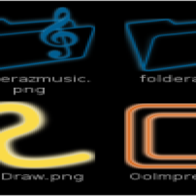
*added a variety of folder icons
0.1
*basic folder icons












Ratings & Comments
15 Comments
hey =) maybe this litle (very buggy) prog helps u to create a Gnometheme, needs imagemagick and the gtk-sharp libarys to start. and must start it with "mono gib.exe" just try it out =) http://developer.novell.com/wiki/index.php/Special:Downloads/gib/bin/0.2/
I like the icons, and in particular, the red colour scheme. I would definitely use a set on my laptop if they were available. It is always good to see an alternative to the status-quo. I feel that there is an over-abundance of blue when it comes to KDE. Stick at it m8. Look forward to giving them a try.
Now you're just teasing us with your previews ;) As an existing SabayonLinux user these will go great with my desktop. I can't wait till they're done. If I knew how to make the themes then I would help you. Maybe I'll try to learn before you finish them ! keep up the good work Cheers Dave
Definitely stay on top of it, this is one icon set I will use.
I was mostly refering to the firefox icon and the trash icons, the desktop icon and maybe the computer icon at lower resolution...when they're 256x256 they're fairly easy to recongnize, but at lower resolutions might be harder to...over all its a good project which is why i bothered to comment in the first place
I agree with you, I don't like the trash and it isn't very clear. There are many icons to be made and I will definitely go back through and fix those as the set evolves.
I think they might be a bit too busy and to hard to recognize immediately...most good icons are very distinctive and tend more towards simplicity in an effort to make them immediately recognizable...I'm not art major, or GUI expert, but I thought they were a bit too involved. anyways, i really did like how they were quite original and not just a rehash, and they definitely weren't boring. keep working!
First off thank you '4x2mile' for your constructive criticism and thank you everyone for you comments and votes. I'm not designing this Icon set for just myself so the more input the better. You don't need a doctorate in Art to know when something looks like crap. I understand that they are busy and they will become even more detailed as I revise them. Simplicity is not my goal for this icon set, but clarity is. I would like to know what specific icons are unclear. Remember a lot of icons that people think are clear and easy to recognize is sometimes due to familiarity. For instance the Firefox Icon itself doesn't scream internet browser, but something more like 'A giant hell beast has engulfed the earth, run for your lives'. Once I am done designing the first approximately hundred to two hundred icons, I will go back through and definitely add variations.
nice! these icon roXx(!) ... thumbs up =D
#1. Incomplete #2. Absolutely friggin' stunning. "good work" does little to convey my gratitude and envy. Magnificent work. h come work with us on the logo(s) for tux500.com
These are perfect!!! Wish I had your talent :-)
Happy birthday! :)
Thanks for the feedback. I am hoping to have a good portion of this icon set ready by May 2007. I would like to have a good collection of basic Icons found on most peoples machines instead of sending out an incomplete theme. If anyone has a request on specific additions, please post a comment.
I have a rather dark desktop and am looking forward to try it there...
I think it's beautiful. Slick, the black & red. It's pretty original, and stylish. Would fit sabayon pretty well, too.