


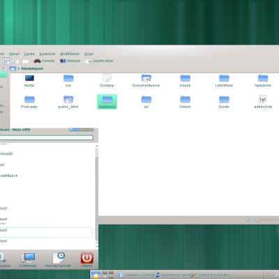
Rosa 2012.1 enhancement
netean


Source (link to git-repo or to original if based on someone elses unmodified work):
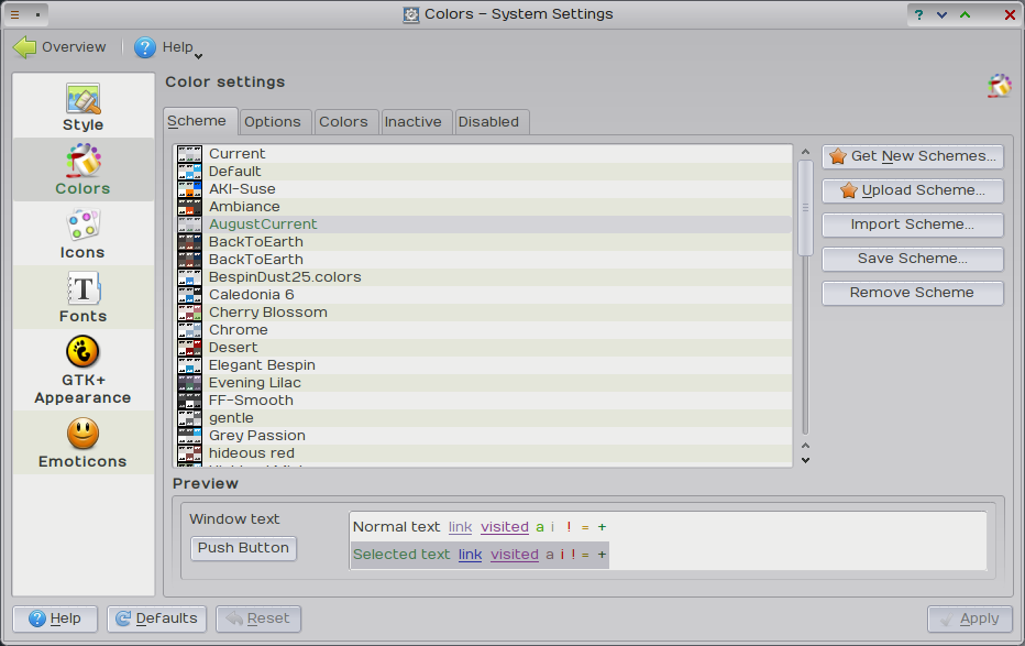
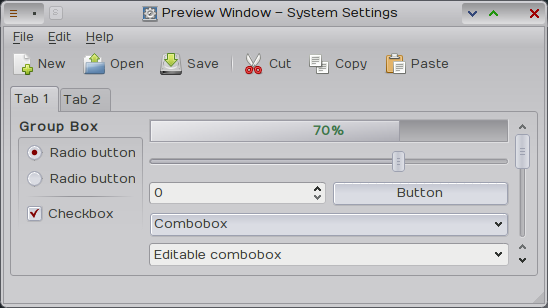
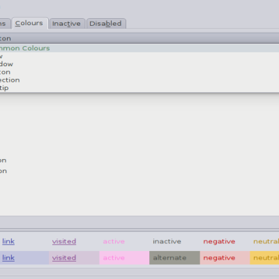
Recently changed the focus and selection colour to a brighter shades of green. Checked all color states have contrast and are readable.
Tones down the alternate background color, still visible, just more subtle.
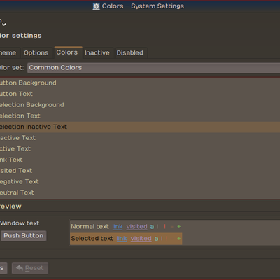
Changed button color and to be more obvious yet less obtrusive.
toned down the inactive window difference, now more subtle I hope.
Darkened the overall grey, so it\'s not \"dark\" yet not \"plain\" grey.
Improved tooltip visibility and colorised the selection color (it was light grey)


Ratings & Comments
0 Comments