Image 01
profile-image

airdrik

Eric Francis Boise, ID, United States of America
Freeze

Plasma Themes by MirceaKitsune 13 comments

I'm using KDE+Plasma 4.
The style for the search box is styled by the theme. Examples in other themes include Colorbit: button text on a light gray background w/gradient, Doomsday (http://kde-look.org/content/show.php/Doomsday?content=159938): uses white text on a black background, Aya: uses button text on a (semi-transparent?) medium gray background.

I'm not sure where the background for the search/input box is defined, but I'm guessing it's an svg file since some styles use gradients or custom borders. - Mar 13 2015
Freeze

Plasma Themes by MirceaKitsune 13 comments

Very nice theme, I like it a lot (I'm a fan of plasma themes which follow the desktop color scheme, which I customize heavily).

I do run into a problem when using white/light text on dark backgrounds with this theme: text entry boxes (like the search box in the Add Widgets panel or Homerun) have a (nearly) white background, and the white-on-white is unreadable.
Is there a way to change that to something more neutral (or preferably use the view background color from the color scheme)? I imagine that if it can't be set up to pull from the color scheme then using a medium grey should be sufficient so that it can be usable with either white/light or black/dark text. - Mar 12 2015
Summer Evening

Plasma Color Schemes by airdrik 3 comments

The font is called Baumans and I pulled it from Google's web fonts project: http://www.google.com/webfonts/specimen/Baumans - Apr 04 2012
Midnight Ballroom

Wallpaper Other by LiquidSky64 3 comments

Love it! Love it! Love it!
The backdrop is perfect, love the poses - each couple has their own personality, I want to be there, too; dancing some tango nice and smooth. - Sep 27 2011
Slate

Plasma Color Schemes by airdrik 4 comments

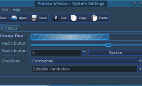
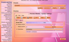
QtCurve widgets+borders, Smooth style ->
http://kde-look.org/content/show.php/Smooth?content=143112
Elementary Icons - Jul 03 2011
Slate

Plasma Color Schemes by airdrik 4 comments

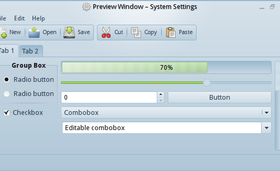
Glad you like it.

I've never really liked the bland greyscale used by most color schemes.
I think this one gets just the right tone for the blue where it isn't bland greyscale, but isn't hurts-your-eyes bright. - Jun 29 2011
Ok, thanks for the reply.
I tried out the tiled background, and that works fine, but still suffers from the same won't-remove-the-file bug as the other setting. - Mar 22 2011
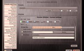
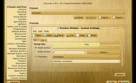
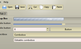
I've been playing around with using different images for the window background (some examples: http://opendesktop.org/content/show.php/DomQT?content=139732 http://opendesktop.org/content/show.php/Textured+Gray?content=140094 http://opendesktop.org/content/show.php/Textured+Tan?content=140090)

A bug that I ran into is that when you select one file for the background (and apply it) then select a different file for the background, it doesn't actually switch the stored image. The workaround is to delete ~/.config/qtcurve/style-bgnd-img.* then go in and pick the new image.
A couple of features which would be nice: scale image to window size (may be infeasible due to cpu usage) and tile image. - Mar 21 2011
Textured Gray

QtCurve by airdrik 3 comments

There's a bug in qtcurve with the background images - when you try to change the background image, it doesn't actually replace the stored image with the new image. (I need to file a bug report, but haven't gotten around to it yet)
The work-around is you need to browse to ~/.config/qtcurve/ and delete style-bgnd-img.*, then re-select the new config. - Mar 20 2011
IRRWEG NR 5-2011

Wallpaper Other by jfest 1 comment

that is quite the maze you have going on there! - Feb 10 2011
Meditata

Wallpaper Other by ubergoober 3 comments

I really like how this one turned out - at a distance (or when looking at the thumbnail) it looks like a flower. Nice mixture of purple and green with the pink highlights. - Dec 07 2010
A-Black-Nostrum-0.17.2

Enlightenment Themes by verdegal37 7 comments

I really like what you've done in this iteration of the theme.
One problem I have with this theme is that the border needs some love. The bubble in the middle of the title makes the black title text practically unreadable, and the titlebar itself (in particular the buttons) is rather small and not as elegant-looking as the rest of the theme.

The rest of the theme looks wonderful, thank you! - Sep 25 2009
Midnight Ballroom

Wallpaper Other
by LiquidSky64

6.5
Sep 27 2011
reflection

Wallpaper Other
by renetmandriva

5.3
3   May 15 2012
reflection

Wallpaper Other
by renetmandriva

5.3
3   May 15 2012
Kotonaru

Plasma Themes
by mcder

7.3
9   Apr 29 2012
Blue Sora

Full Icon Themes
by Deathmachine

8.0
9   Apr 29 2012
FS Icons

Full Icon Themes
by franksouza183

8.0
9   Apr 29 2012
Cloudsdale generation

Plasma Color Schemes
by oOSplashOo

6.1
9   Apr 26 2012
Brilliance

Plasma Color Schemes
by frag

6.5
9   Apr 26 2012
oxyTablets

Full Icon Themes
by gardmo

8.3
9   Mar 05 2012
Lullaby of Night

Wallpaper Other
by LiquidSky64

7.2
9   Feb 21 2012
Blue Sora

Plasma Themes
by Deathmachine

8.3
9   Jan 11 2012
Clarion

Plasma Color Schemes
by smashse

6.1
9   Dec 28 2011
ia-ora-cold

Plasma Color Schemes
by almusalimalmusalimah

6.8
9   Dec 28 2011
Chrysokoll

Plasma Color Schemes
by Robbi1987

5.8
9   Dec 28 2011
ice crystals - shadow

Wallpaper Other
by jamjam

5.7
9   Dec 04 2011
Blue Snow

Wallpaper Other
by Aicani

6.1
9   Dec 04 2011
USU 5

Wallpaper Other
by lokster

7.0
9   Dec 02 2011
Stardust

Wallpaper Other
by LiquidSky64

7.5
9   Nov 15 2011
6.4
9   Nov 15 2011
Midnight Ballroom

Wallpaper Other
by LiquidSky64

6.5
9   Sep 27 2011
BlueTintGlass

Plasma Themes
by KovacsM

7.8
9   Mar 20 2011