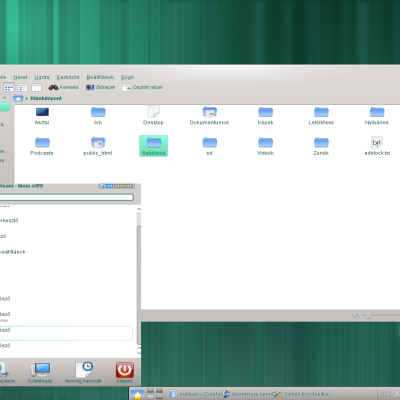
Description: Fully desaturated, avoids "wrong" color perception (happens with fake greys schemes). Enhances readability and productivity. Designed with writers, programmers and graphic designers in mind.Last changelog:
0.1: initial concept 0.2: Lab color space migration 0.3: Contrast improved (backgrounds adjustments)
With Lab color space migration I noticed that the contrast is maybe too low.. I'm planning to lighten the backgrounds of ~10% max. Text values and colors are ok ;)
Please give feedbacks!
Using it and loving it at the time, I've always found to be very difficult (nearly impossible) to stay away from Oxygen-cold, now for the first time I'm using a different color scheme. Thanks, keep the good work.
great color scheme, almost perfect!
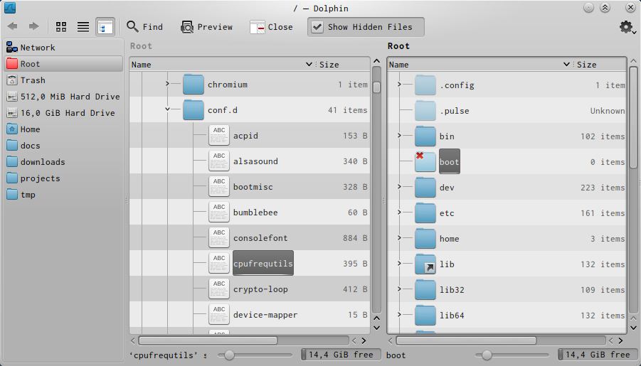
but imho link color on normal background needs to be adjusted (for example, see links in dolphin's information panel, like 'add tags', 'add comments', ecc...)
Hello, and thanks for feedback!
Many text colors need adjustments, indeed. We would like to rationalize the hues for them, and equalize values to have, for all texts on a particular area, the same perceived lightness.
This first version is only a first scratch, so stay tuned for updates :)
Hi, colored text is now implemented :)
I adopted Lab color space, so the different colors (like Active, Negative, Neutral, Positive, Link, Visited) for a particular region look with almost uniform perceived lightness..
Update :D !


Ratings & Comments
9 Comments
Good Job! ;)
Thanks!
Very nice color scheme, thanks!
With Lab color space migration I noticed that the contrast is maybe too low.. I'm planning to lighten the backgrounds of ~10% max. Text values and colors are ok ;) Please give feedbacks!
Using it and loving it at the time, I've always found to be very difficult (nearly impossible) to stay away from Oxygen-cold, now for the first time I'm using a different color scheme. Thanks, keep the good work.
Thanks for good feedback! I just updated the theme . . . Hope it looks better :D
great color scheme, almost perfect! but imho link color on normal background needs to be adjusted (for example, see links in dolphin's information panel, like 'add tags', 'add comments', ecc...)
Hello, and thanks for feedback! Many text colors need adjustments, indeed. We would like to rationalize the hues for them, and equalize values to have, for all texts on a particular area, the same perceived lightness. This first version is only a first scratch, so stay tuned for updates :)
Hi, colored text is now implemented :) I adopted Lab color space, so the different colors (like Active, Negative, Neutral, Positive, Link, Visited) for a particular region look with almost uniform perceived lightness.. Update :D !